library(tidyverse)
library(janitor)
options(dplyr.summarise.inform = FALSE)Points vs salaries
Warning
This notebook is just exploratory and a work in progress. There are no particular findings at this time.
Goal of this notebook
Does spending more on players ensure a better season? I want to compare season points to salaries spent by MLS teams.
I thought I had found some standings data on kaggle, but it only goes through part of 2021.
I worked it out using 2020 data, but there is nothing to really show.
Setup
Download
I scraped the MLS 2023 standings and put them in a Google Sheet where I hand-edited some columns to clean it up. (It was just quicker because of some non-consisten patterns in the scrapped team name.)
download.file("https://docs.google.com/spreadsheets/d/e/2PACX-1vQwM9NKGZEc5CKVR2z7IoEUq0nij77xNu6kz8Rua4JFNfqt0sOe5RaE8gwW2lZ0nSsAFH5aCNUQJrcV/pub?output=csv", "data-original/mls-standings-2023.csv")I haven’t used this as of yet.
Importing
mls_standings <- read_csv("data-original/all_tables.csv") |> clean_names()
mls_salaries <- read_rds("data-processed/mls-salaries.rds")
mls_standings_2023 <- read_csv("https://docs.google.com/spreadsheets/d/e/2PACX-1vQwM9NKGZEc5CKVR2z7IoEUq0nij77xNu6kz8Rua4JFNfqt0sOe5RaE8gwW2lZ0nSsAFH5aCNUQJrcV/pub?output=csv")
Salaries
Starting with salaries data since this is “cleaned” already.
sal_20 <- mls_salaries |>
  filter(year == "2020") |>
  group_by(club_long, conference) |>
  summarise(team_salary = sum(compensation))

sal_20
Standings
Checking what we have for standings data.
mls_standings |>
  summarise(
    yr_old = min(year),
    yr_new = max(year)
  )
Trying this with 2020 anyway
Peek at the data
std_20 <- mls_standings |> filter(year == "2020")Cleaning names
There are some issues here with team names. There are notes on the names and some names are different than what is used with MLS Salaries.
std_20_clean <- mls_standings |>
  filter(year == "2020", conference == "Overall") |>
  mutate(
    team_clean = str_remove_all(team, regex("\\[.\\]|\\(.\\)")) |> str_trim(),
    team_new = case_match(
      team_clean,
      "Columbus Crew SC" ~ "Columbus Crew",
      "Houston Dynamo" ~ "Houston Dynamo FC",
      "Los Angeles FC" ~ "LAFC",
      "Vancouver Whitecaps FC" ~ "Vancouver Whitecaps",
      .default = team_clean
    )
  ) |>
  arrange(team_new) |>
  distinct(team_new, pts)


std_20_clean
Put them together
combined_20 <- sal_20 |>
  left_join(std_20_clean, by = join_by(club_long == team_new)) |>
  drop_na()

combined_20
Plot the relationship
ggplot(combined_20) +
  aes(x = pts, y = team_salary) +
  geom_point(aes(color = conference), size = 4) +
  # geom_text(aes(label = club_long)) +
  ggrepel::geom_text_repel(aes(label = club_long), size = 3)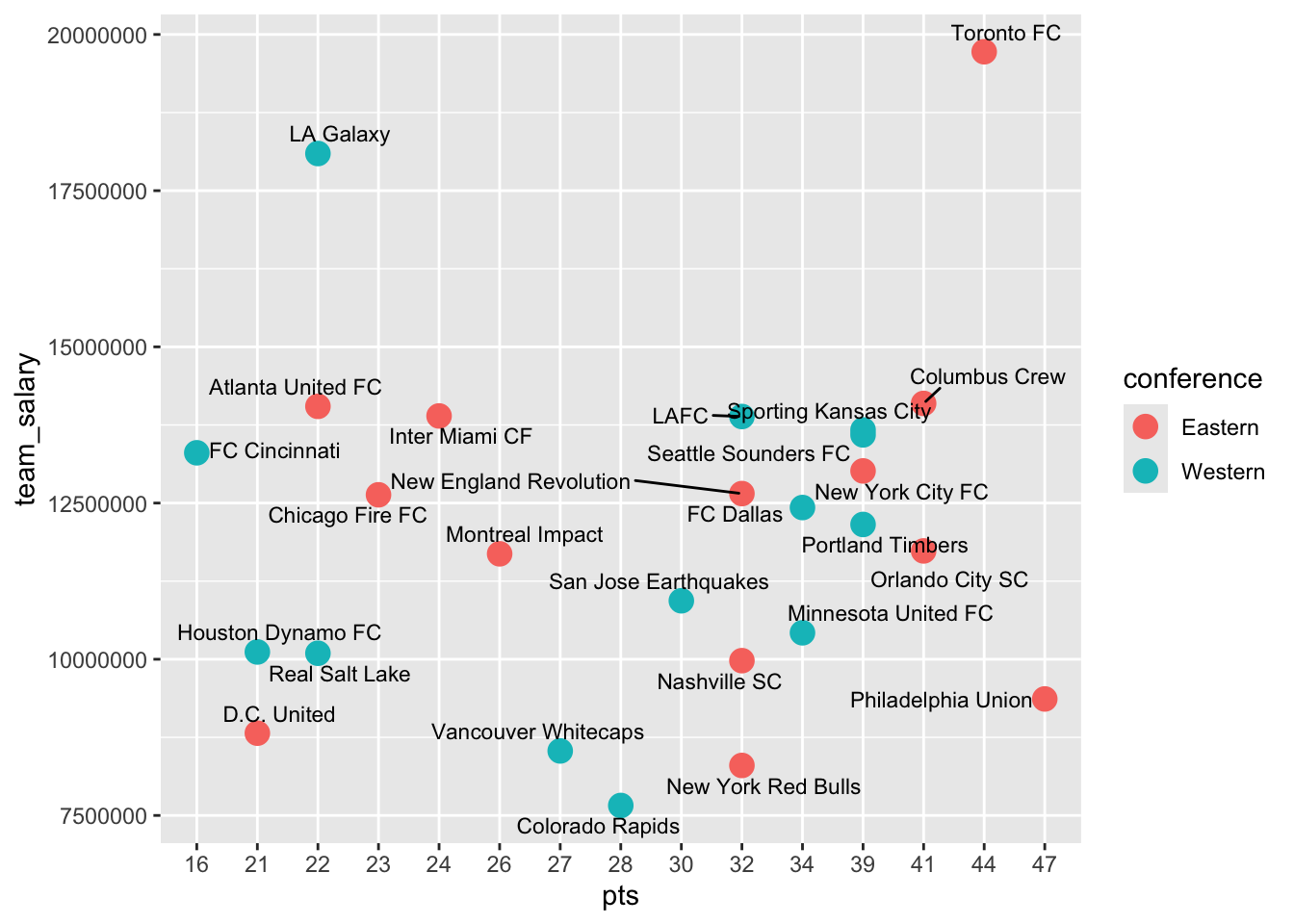
There isn’t one, really. At least not for this year. It’s also difficult to read.