library(tidyverse)
library(janitor)
library(usfootballR)
library(teamcolors)
library(scales)MLS colors
Here I’m trying out different API products to find colors to use in these charts. I end up creating my own color listings based on several sources because all the existing R sources are out of date or I don’t like their choices.
The results of this work ends up in a file that is used in the analysis notebook.
Import
Getting our data
salaries <- read_rds("data-processed/mls-salaries.rds")

salaries |> glimpse()
Rows: 11,285
Columns: 9
$ year <chr> "2007", "2007", "2007", "2007", "2007", "2007", "2007", "…
$ club_short <chr> "CHI", "CHI", "CHI", "CHI", "CHI", "CHI", "CHI", "CHI", "…
$ last_name <chr> "Armas", "Banner", "Barrett", "Blanco", "Brown", "Busch",…
$ first_name <chr> "Chris", "Michael", "Chad", "Cuauhtemoc", "C.J.", "Jon", …
$ position <chr> "M", "M", "F", "F", "D", "GK", "F", "D", "M", "D", "D", "…
$ base_salary <dbl> 225000.0, 12900.0, 41212.5, 2492316.0, 106391.0, 58008.0,…
$ compensation <dbl> 225000.0, 12900.0, 48712.5, 2666778.0, 106391.0, 58008.0,…
$ club_long <chr> "Chicago Fire FC", "Chicago Fire FC", "Chicago Fire FC", …
$ conference <chr> "Eastern", "Eastern", "Eastern", "Eastern", "Eastern", "E…I need to make some data to use
sal_team <- salaries |>
  group_by(year, club_long) |>
  summarise(total_compensation = sum(compensation)) |>
  arrange(total_compensation |> desc())
`summarise()` has grouped output by 'year'. You can override using the
`.groups` argument.sal_team_rank <- salaries |>
filter(club_short != "MLS" | club_short |> is.na()) |>
group_by(year, club_short, club_long) |>
summarise(
total_comp = sum(compensation, na.rm = TRUE)
) |>
arrange(year, total_comp |> desc()) |>
ungroup() |>
mutate(rank = rank(-total_comp), .by = year)`summarise()` has grouped output by 'year', 'club_short'. You can override
using the `.groups` argument.sal_team_rank_top <- sal_team_rank |>
filter(rank <= 5,
year >= "2020")
sal_team_rank_topManual colors
My attempt to make a record of MLS colors. This is based on TeamColorCodes but with additional column favored_color that is my best choice for charts. I’m building this in the same spreadsheet as my teams/seasons list but on a different sheet.
I started with the list above fro usfootballr’s espn colors.
Download the data
# download.file("https://docs.google.com/spreadsheets/d/e/2PACX-1vQqXJxbbrBsikirZrGyXYV_G6cFZp_dYmcf52UfSYM7Kw3akGlkO5jKP8ZL8WtRA5qUJgFMNPG8JYov/pub?output=csv&&gid=1348329208", "data-processed/clubs-colors.csv")Import that data
mls_colors_data <- read_csv("data-processed/clubs-colors.csv")Rows: 30 Columns: 7
── Column specification ────────────────────────────────────────────────────────
Delimiter: ","
chr (7): club_short, club_long, primary_color, secondary_color, tertiary_col...
ℹ Use `spec()` to retrieve the full column specification for this data.
ℹ Specify the column types or set `show_col_types = FALSE` to quiet this message.mls_colors_dataPreview the colors
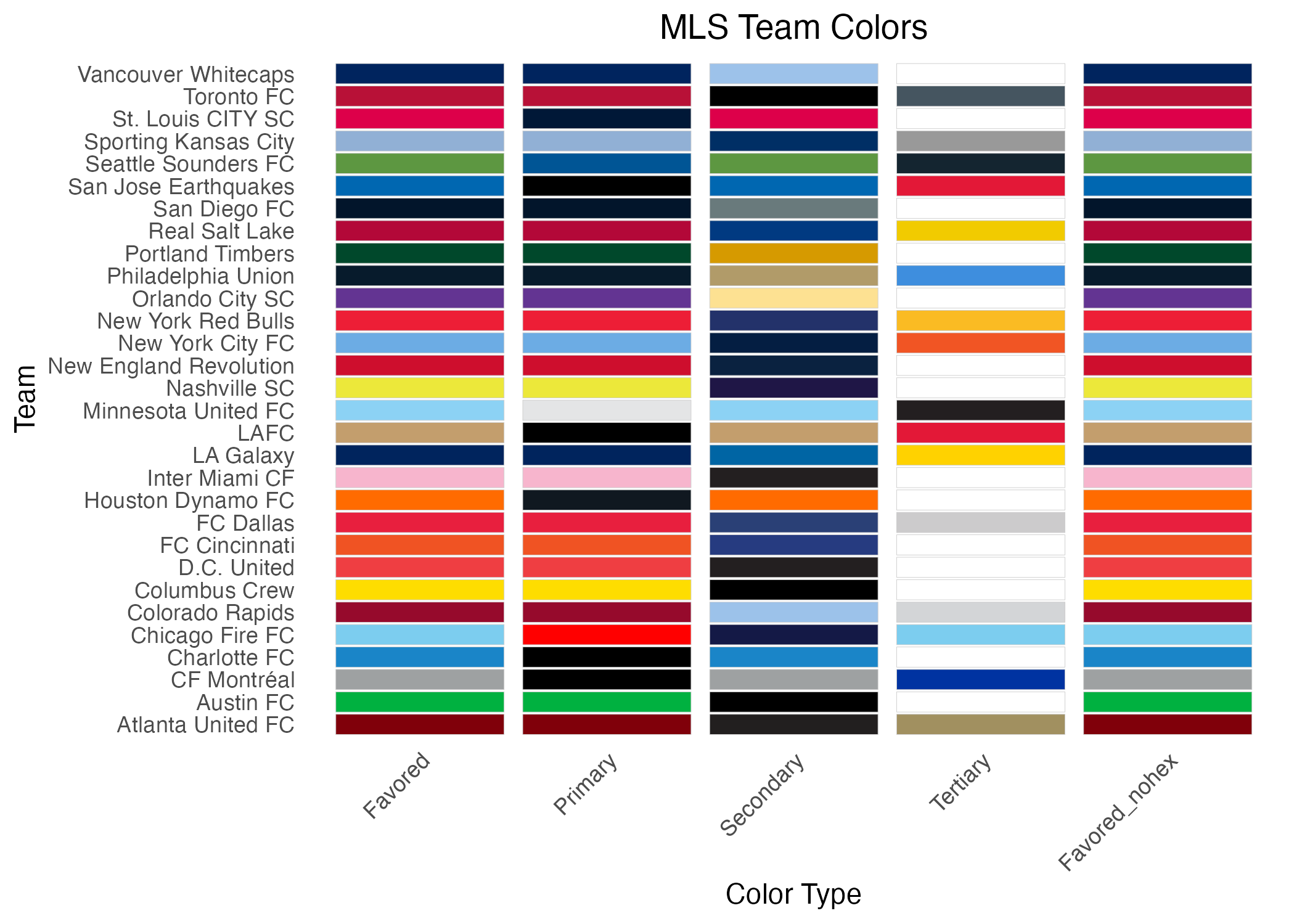
This chart is totally a Claude.ai chart. I startd with this prompt: “I want to use ggplot, or at least R, to print a color swatch based on a data frame like this” and listed some data. Claude said it can’t display R so it did it in React! So I asked “Can you guess at the ggplot code?” and it gave me what was below (as well as another alternative I didn’t like.) All I had to do is change the data frame name.
That said, I’ve made several modifications since.
# Convert the data from wide to long format for plotting
teams_long <- mls_colors_data |>
  pivot_longer(
    cols = !c(starts_with("club")),
    names_to = "color_type",
    values_to = "color_hex"
  ) |>
  # Clean up color_type names for display
  mutate(
    color_type = str_to_title(gsub("_color", "", color_type)),
    color_type = fct_relevel(color_type, "Favored", "Primary", "Secondary", "Tertiary"),
    # Ensure all color codes have # prefix
    color_hex = ifelse(startsWith(color_hex, "#"),
                      color_hex,
                      paste0("#", color_hex))
  )

teams_long |> slice_sample(n = 8) # I added this line
Then plot a visual of theses so I can check them.
# Create the plot
mls_team_colors_plot <- ggplot(teams_long,
       aes(x = color_type,
           y = club_long)) +
  geom_tile(aes(fill = color_hex),
            color = "gray80",  # Add border to tiles
            width = 0.9,
            height = 0.9) +
  scale_fill_identity() +  # Use actual hex colors
  theme_minimal() +
  theme(
    axis.text.x = element_text(angle = 45, hjust = 1),
    panel.grid = element_blank(),
    plot.title = element_text(hjust = 0.5)
  ) +
  labs(
    title = "MLS Team Colors",
    x = "Color Type",
    y = "Team"
  )

ggsave("figures/mls_team_colors_plot.png")
Saving 7 x 5 in image
I can use this to adjust the data on which is the
favored_color. I’ll update the data and then charts that use that data will update when they are next downloaded and run.
Do the salary chart
I need to prepare the data so I can test it within a real chart.
sal_team_2024_data <- sal_team_rank |>
  filter(year == "2024") |>
  drop_na(club_short) |>
  left_join(mls_colors_data, join_by(club_short, club_long)) |>
  select(!c(primary_color, secondary_color, tertiary_color))

sal_team_2024_data
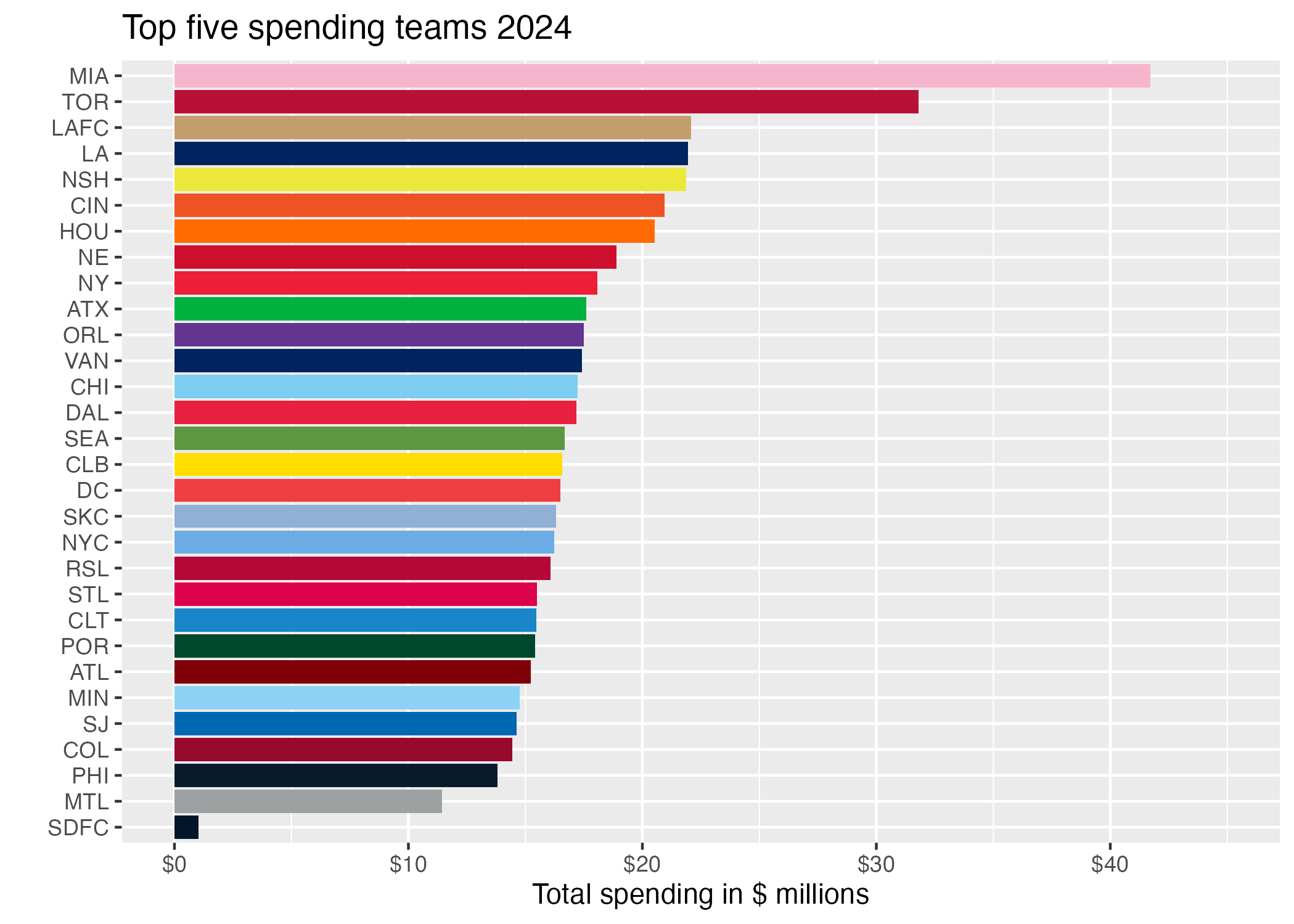
Then plot it.
For the life of me I can’t figure out how to reverse the team names to start with Atlanta.
sal_top_2024_col_plot <- sal_team_2024_data |>
  ggplot(aes(x = reorder(club_short, total_comp), y = total_comp)) +
  # geom_col(color = sal_top_2023_col$color, fill = sal_top_2023_col$alternate_color) +
  geom_col(fill = sal_team_2024_data$favored_color) +
  scale_y_continuous(labels = label_dollar(scale = .000001, accuracy = 2),
                     limits = c(0, 45000000)) +
  # geom_text(aes(
  #   label = dollar(total_comp, scale = .000001, accuracy = 3, digits = 2), hjust = -.25)
  # ) +
  coord_flip() +
  labs(
    title = "Top five spending teams 2024",
    y = "Total spending in $ millions",
    x = ""
  )

ggsave("figures/team-salary-2024-color-manual.png")
Saving 7 x 5 in image
usfootballr package
Here I try to use the colors from the usfootballr package and apply them to a chart.
Here is what comes from the package for teams:
espn_teams <- espn_mls_teams()

espn_teams |> head()
Now I want to use my ranking data to try and color bars based on data from the package.
sal_top_2023 <- sal_team_rank |> left_join(espn_teams, join_by(club_short == abbreviation)) |>
  select(1:4, 11:12) |>
  filter(year == "2023")

sal_top_2023_col <- sal_top_2023 |>
  mutate(color = paste("#", color, sep = ""),
         alternate_color = paste("#", alternate_color, sep = "")
        ) |>
  drop_na()

sal_top_2023_col
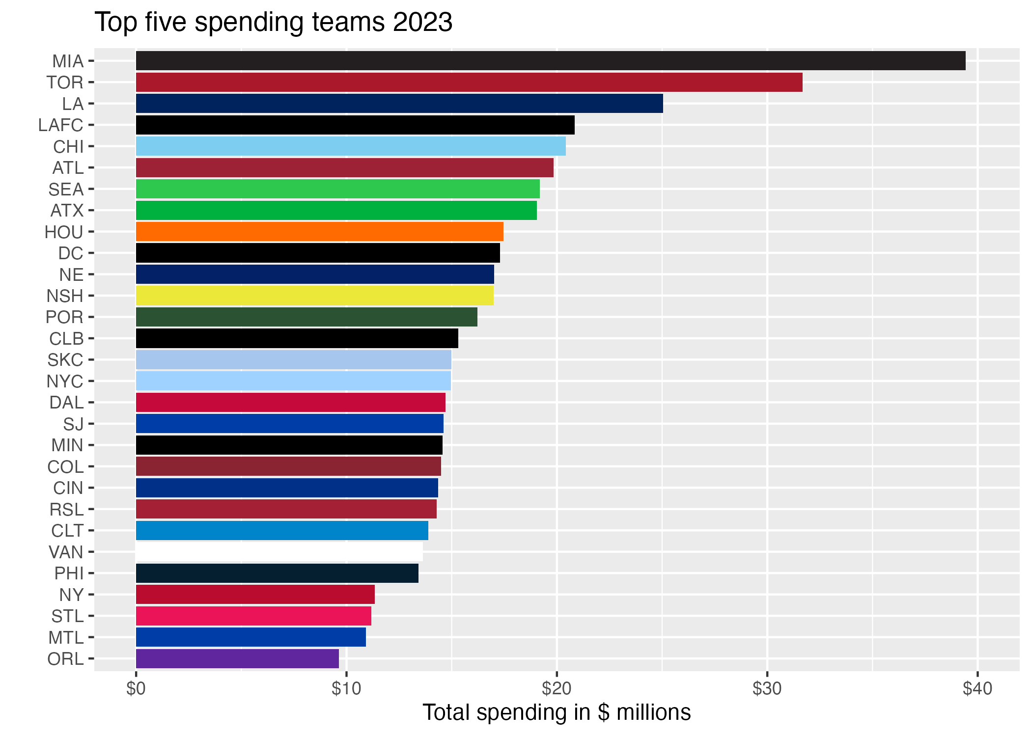
Now to plot with the color?
The geom_text label I was trying below needed a decimal point and not as much rounding, but I’m not going to figure that out right now.
sal_top_2023_col_plot <- sal_top_2023_col |>
  ggplot(aes(x = reorder(club_short, total_comp), y = total_comp)) +
  # geom_col(color = sal_top_2023_col$color, fill = sal_top_2023_col$alternate_color) +
  geom_col(fill = sal_top_2023_col$color) +
  scale_y_continuous(labels = label_dollar(scale = .000001, accuracy = 2),
                     limits = c(0, 40000000)) +
  # geom_text(aes(
  #   label = dollar(total_comp, scale = .000001, accuracy = 3, digits = 2), hjust = -.25)
  # ) +
  coord_flip() +
  labs(
    title = "Top five spending teams 2023",
    y = "Total spending in $ millions",
    x = ""
  )

ggsave("figures/team-salary-2023-color-usfootballr.png")
Saving 7 x 5 in image
While this works and they have all the current teams, in some cases we would want the alternative color for a team if the main color is black or white.
teamcolors package
We’ll try this, but from older data because they won’t have some teams.
mls_colors <- teamcolors |> filter(league == "mls") |>
  select(1, 3:4)

mls_colors_udpated <- mls_colors |>
  mutate(club_long = recode(
    name,
    "Chicago Fire" = "Chicago Fire FC"
  )) |> select(-name)

sal_team_2019 <- sal_team |> filter(year == 2019) |>
  left_join(mls_colors_udpated, join_by(club_long)) |>
1  drop_na(primary, secondary)


sal_team_2019- 1
- I had to drop rows that didn’t have their color or this would break.
sal_team_2019  |>
  # drop_na(primary, secondary) |>
  ggplot(aes(y = club_long |> reorder(total_compensation), x = total_compensation)) +
  geom_col(fill = sal_team_2019$primary) +
  scale_x_continuous(labels = label_dollar(scale = .00001, accuracy = 2)) +
  geom_text(aes(
    label = dollar(total_compensation, scale = .00001, accuracy = 2, digits = 3)),
    color = "white", hjust = 1.25
  ) +
  labs(
    title = "Totally incomplete list of 2019 salaries",
    subtitle = "Only includes clubs with color values in \"teamcolors\" package.",
    y = "",
    x = "Team spending in $ millions"
  )
The colors are much nicer here, but not all the teams are represented. It is at least four years out of date.