library(tidyverse)
library(janitor)
library(usfootballR)
library(teamcolors)
library(scales)API explore
Here I’m trying out different API products to use with MLS Salaries
Import
Getting our data
salaries <- read_rds("data-processed/mls-salaries.rds")

salaries |> glimpse()
Rows: 11,249
Columns: 9
$ year <chr> "2007", "2007", "2007", "2007", "2007", "2007", "2007", "…
$ club_short <chr> "CHI", "CHI", "CHI", "CHI", "CHI", "CHI", "CHI", "CHI", "…
$ last_name <chr> "Armas", "Banner", "Barrett", "Blanco", "Brown", "Busch",…
$ first_name <chr> "Chris", "Michael", "Chad", "Cuauhtemoc", "C.J.", "Jon", …
$ position <chr> "M", "M", "F", "F", "D", "GK", "F", "D", "M", "D", "D", "…
$ base_salary <dbl> 225000.0, 12900.0, 41212.5, 2492316.0, 106391.0, 58008.0,…
$ compensation <dbl> 225000.0, 12900.0, 48712.5, 2666778.0, 106391.0, 58008.0,…
$ club_long <chr> "Chicago Fire FC", "Chicago Fire FC", "Chicago Fire FC", …
$ conference <chr> "Eastern", "Eastern", "Eastern", "Eastern", "Eastern", "E…I need to make some data to use
sal_team <- salaries |>
  group_by(year, club_long) |>
  summarise(total_compensation = sum(compensation)) |>
  arrange(total_compensation |> desc())
`summarise()` has grouped output by 'year'. You can override using the
`.groups` argument.sal_team_rank <- salaries |>
filter(club_short != "MLS" | club_short |> is.na()) |>
group_by(year, club_short, club_long) |>
summarise(
total_comp = sum(compensation, na.rm = TRUE)
) |>
arrange(year, total_comp |> desc()) |>
ungroup() |>
mutate(rank = rank(-total_comp), .by = year)`summarise()` has grouped output by 'year', 'club_short'. You can override
using the `.groups` argument.sal_team_rank_top <- sal_team_rank |>
filter(rank <= 5,
year >= "2019")usfootballr
Here I try to use the colors from the usfootballr package and apply them to a chart.
Here is what comes from the package for teams:
espn_teams <- espn_mls_teams()

espn_teams |> head()
Now I want to use my ranking data to try and color bars based on data from the package.
sal_top_2023 <- sal_team_rank |> left_join(espn_teams, join_by(club_short == abbreviation)) |>
  select(1:4, 11:12) |>
  filter(year == "2023")

sal_top_2023_col <- sal_top_2023 |>
  mutate(color = paste("#", color, sep = ""),
         alternate_color = paste("#", alternate_color, sep = "")
        ) |>
  drop_na()

sal_top_2023_col
Now to plot with the color?
The geom_text label I was trying below needed a decimal point and not as much rounding, but I’m not going to figure that out right now.
sal_top_2023_col_plot <- sal_top_2023_col |>
  ggplot(aes(x = reorder(club_short, total_comp), y = total_comp)) +
  # geom_col(color = sal_top_2023_col$color, fill = sal_top_2023_col$alternate_color) +
  geom_col(fill = sal_top_2023_col$color) +
  scale_y_continuous(labels = label_dollar(scale = .000001, accuracy = 2),
                     limits = c(0, 40000000)) +
  # geom_text(aes(
  #   label = dollar(total_comp, scale = .000001, accuracy = 3, digits = 2), hjust = -.25)
  # ) +
  coord_flip() +
  labs(
    title = "Top five spending teams 2023",
    y = "Total spending in $ millions",
    x = ""
  )

ggsave("figures/team-salary-2023-color.png")
Saving 7 x 5 in image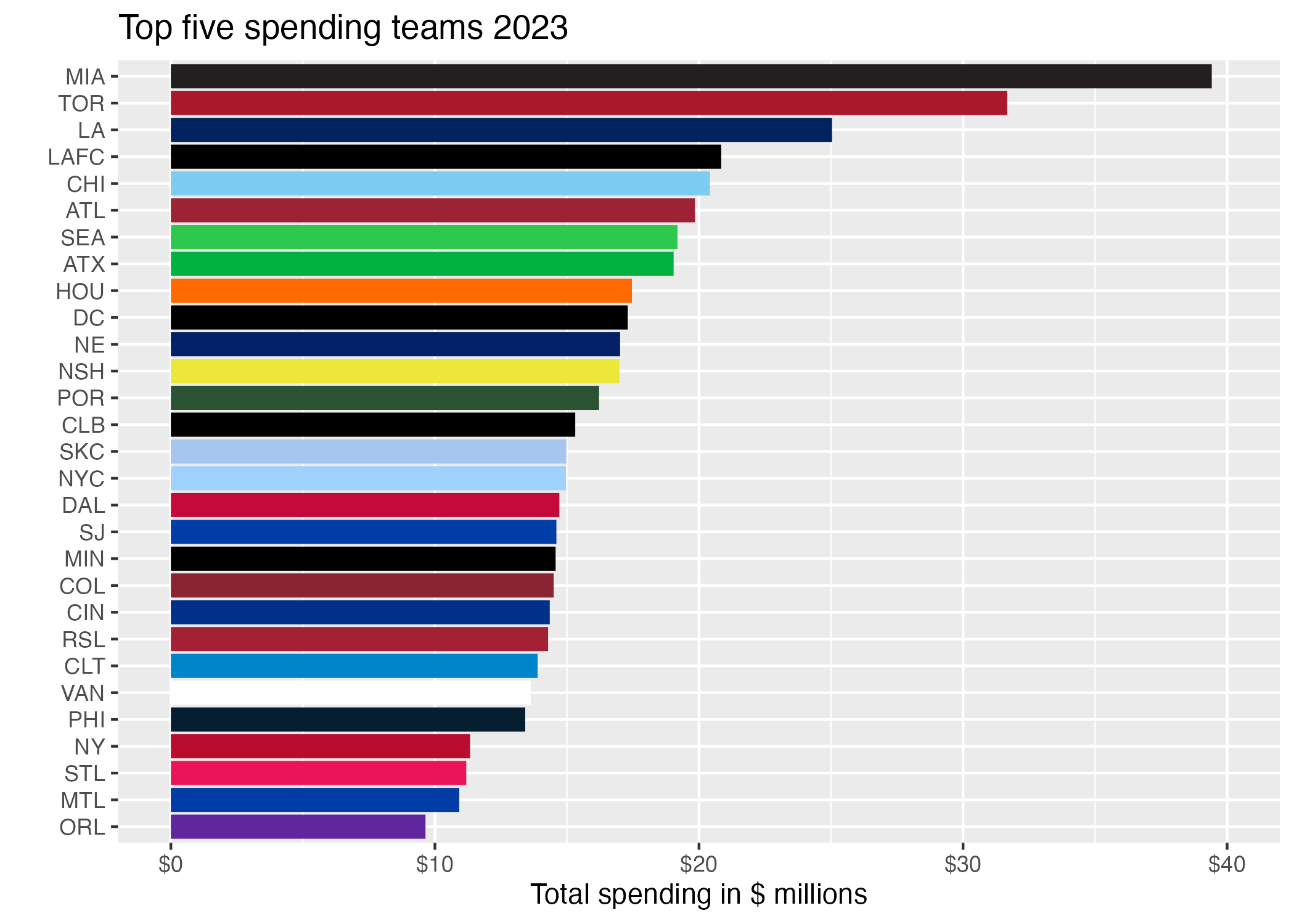
While this works and they have all the current teams, in some cases we would want the alternative color for a team if the main color is black or white.
From teamcolors
We’ll try this, but from older data because they won’t have some teams.
mls_colors <- teamcolors |> filter(league == "mls") |>
  select(1, 3:4)

mls_colors_udpated <- mls_colors |>
  mutate(club_long = recode(
    name,
    "Chicago Fire" = "Chicago Fire FC"
  )) |> select(-name)

sal_team_2019 <- sal_team |> filter(year == 2019) |>
  left_join(mls_colors_udpated, join_by(club_long)) |>
1  drop_na(primary, secondary)


sal_team_2019- 1
- I had to drop rows that didn’t have their color or this would break.
sal_team_2019  |>
  # drop_na(primary, secondary) |>
  ggplot(aes(y = club_long |> reorder(total_compensation), x = total_compensation)) +
  geom_col(fill = sal_team_2019$primary) +
  scale_x_continuous(labels = label_dollar(scale = .00001, accuracy = 2)) +
  geom_text(aes(
    label = dollar(total_compensation, scale = .00001, accuracy = 2, digits = 3)),
    color = "white", hjust = 1.25
  ) +
  labs(
    title = "Totally incomplete list of 2019 salaries",
    subtitle = "Only includes clubs with color values in \"teamcolors\" package.",
    y = "",
    x = "Team spending in $ millions"
  )
The colors are much nicer here, but not all the teams are represented. It is at least four years out of date.